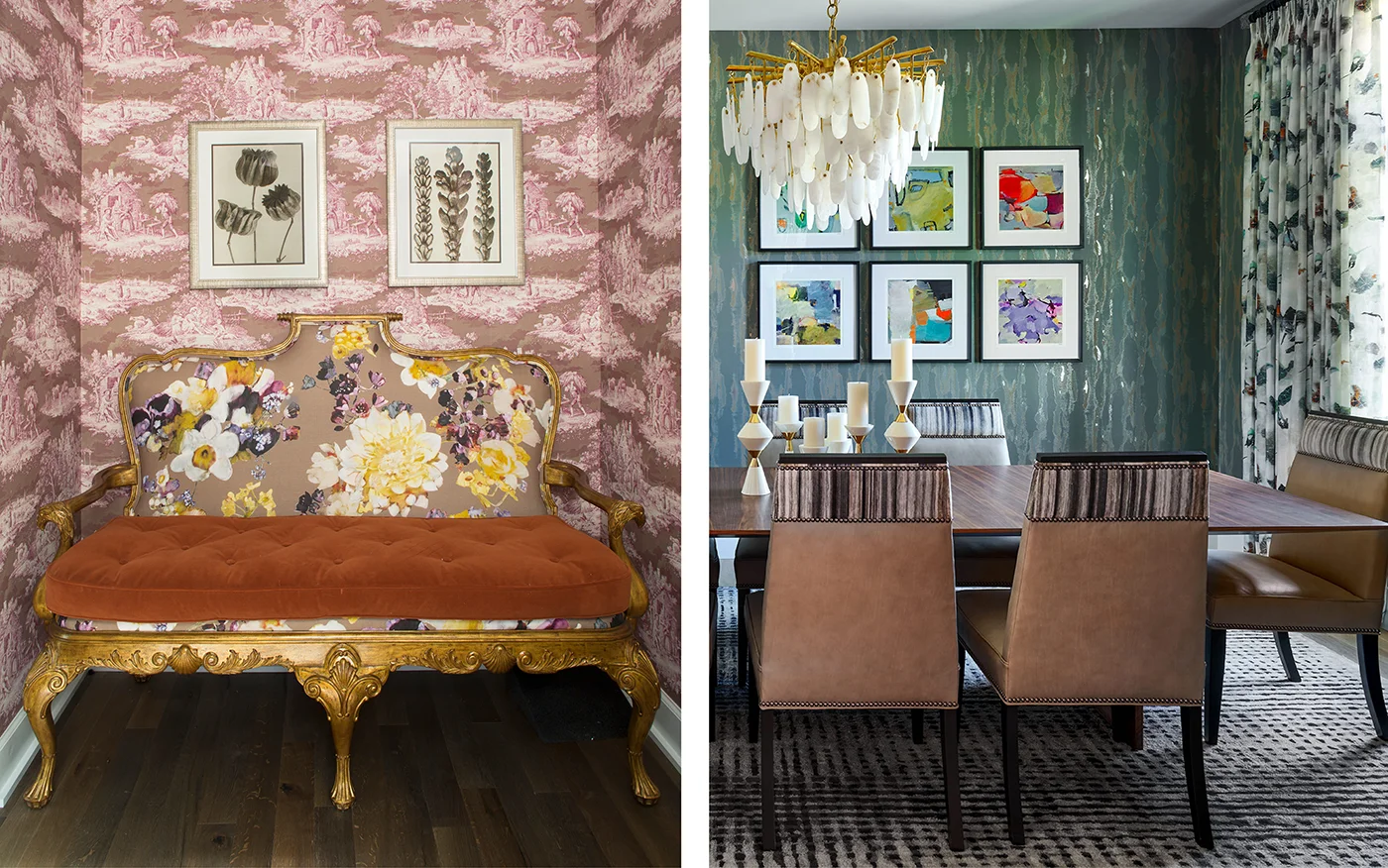
PATTERN PLAY?
People are often worried that pattern play—that is, combinations of patterns in a single room or within a single sightline—will appear busy or clash. And it’s true: There is a right way and a wrong right to mix patterns in a room. Some patterns just don’t belong together. But a good interior designer knows how to mix stripes and florals and tartans and paisleys (for example) to achieve a cohesive, smart, personalized look.
As designers, we consider scale and color, application and balance, to make patterns play well together. (See what we did there?) The result is often transformational for a space.
We value choosing foundational pieces—case goods and furnishings, especially—that are timeless and then layering in patterns, which is where the essence of our clients tends to shine. A good design that appeals to everyone and is very “safe” ends up falling flat because it fails to reflect its inhabitants’ personalities, passions, and loves. When we add in the elements, including patterns in wallcoverings, draperies, pillows, and rugs, we customize the home in truly distinctive ways.
Another bonus of pattern play is that it tends to be the place where we combine couples’ tastes. If one person loves plaid and another likes floral, they’re often surprised and thrilled to see the ways we can satisfy their requests by finding complementing patterns. Both people get what they want in a design that’s elevated and bespoke!
DARK COLORS?
One of the consequences of Instagram’s algorithms (which show you more of what you think you like) is that you get more of the same types of images. So if, several years ago, you began liking the ubiquitous photos of interiors with bright-white walls, you might not have caught all the ways that dark-hued rooms provide charm, moodiness, and coziness.
Or maybe you thought, That looks amazing—but I’d never be so bold.
We think you can be!
You don’t actually have to pick a “side.” At Duet, when we’re designing a luxury home, we often embrace light, bright walls in common spaces with a few dark, saturated rooms to
discover. Often, the rooms that are best served by dark colors are smaller, self-contained spaces: butler’s pantries, offices, powder baths, and the occasional bedroom. We use darker hues—either paint or wallcoverings—to highlight the cozier size. Not all rooms need to feel large. (What’s the point of an expansive powder bath?)
Even clients who expressed some hesitation about deeper, darker hues when we first proposed them often tell us that these spaces are some of their favorites. Color envelopes us, and a smartly chosen hue can simply elevate the experience of the room.
Of course, selecting colors depends on a host of factors, including the light in the room, the space’s function and orientation, furnishings and décor—but to give you a little inspiration,
here are a few of our current dark paint and bold wallcovering faves:
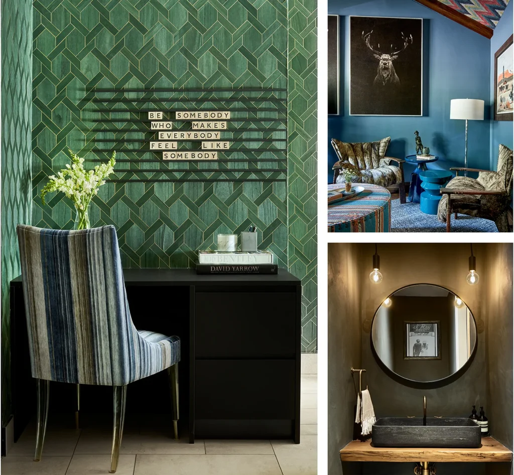
Project Elk Wood, Office Walls: Sherwin Williams, Stargazer | Project Alder, Powder Walls: American Clay
For more brilliant pattern play & bold color ideas, head to our Vail and beaver creek interior design page to discover our residential portfolio and follow us on Instagram!