It’s that time of year again – days are getting shorter, the air is getting crisper, and we’re falling back into routines (and sofas). This month we’re also especially drawn to all things dark and atmospheric, which naturally includes saturated color.
We’re sharing some advice from the Duet Design Group design team about how to approach saturated color, how to incorporate it into designs, and some of their favorite applications. Read on and get SATURATED.
THINGS TO KEEP IN MIND
When designing with saturated color, our design teams consistently focus on balance. It’s important to make sure that saturated color is working “with” and not against a design. Unless we are aiming for something very intense and dramatic, like an all-black powder room, saturated color is typically utilized as a complementary factor in a space and shouldn’t take over the entire experience of a room. Generally the color needs to be balanced with other more neutral elements in the space, which will highlight the color and give it the space it needs to really shine.
We also like to take into consideration the intensity of the color, how much natural light the space gets, and how the color flows with the overall palette in the rest of the house.
And a final takeaway – don’t be afraid of saturated color! It can be so rewarding to incorporate rich, eye-catching color like this in a design, so we encourage everyone to have a little fun with it. Even if you’re not the type to go very bold with color, you can still play with it and use it in subtle ways.
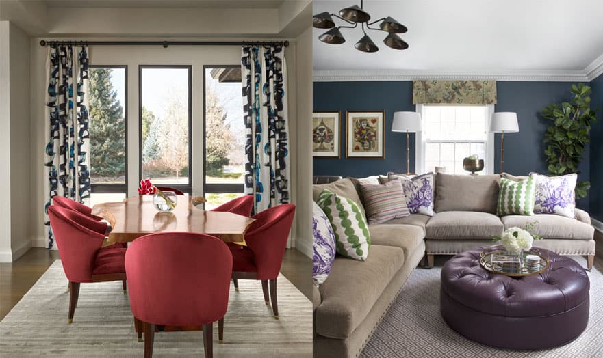
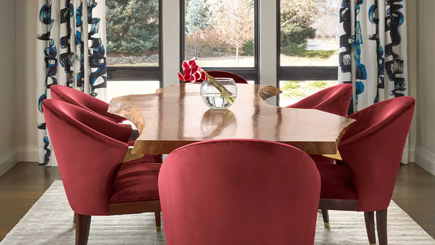
The SOUTH FOREST Project Dining Room and GLENCOE Project Living Room are two perfect examples of balanced saturated color. SOUTH FOREST (left) pairs deep garnet velvet dining chairs with a neutral area rug and contrasting patterned window treatments. GLENCOE (right) juxtaposes a deep plum ottoman and moody teal walls with a light neutral area rug and sofa
HOW TO INCORPORATE
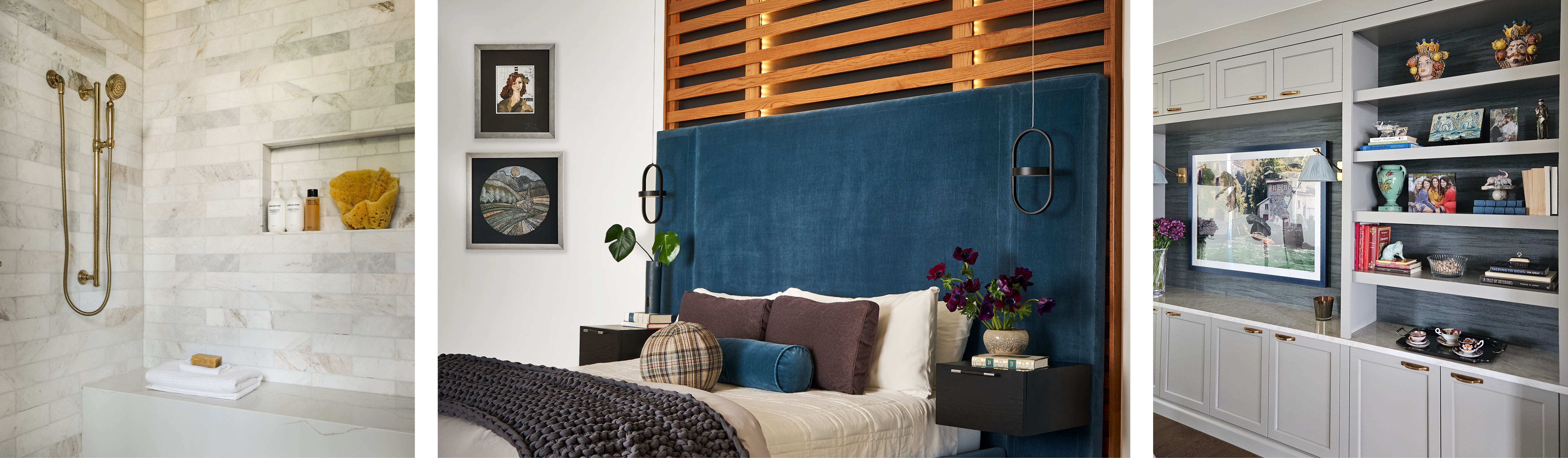
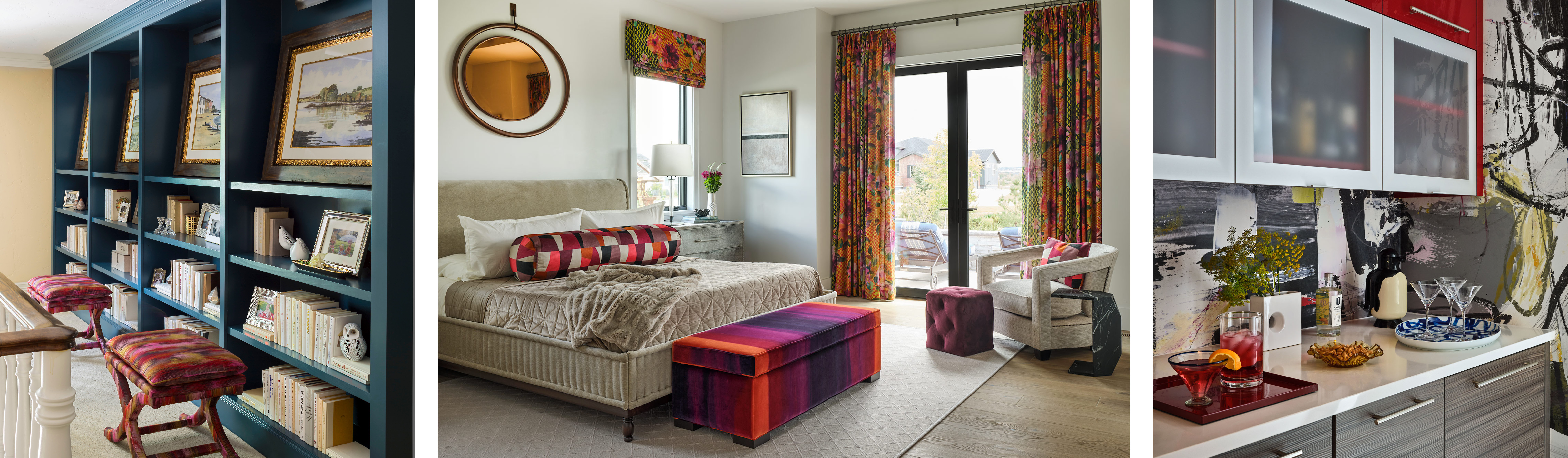
We love the drama saturated color creates and the many ways to incorporate it into a design. From fabrics, backsplashes, artwork, pillows, throws, area rugs, window treatments, and wall coverings, there are a myriad of ways to bring these deep tones into a space.
If the client is open to bold colors, we love to wrap a room in something dramatic – either with a wallcovering or paint color. But if the client isn’t quite ready to go all-in, we can instead bring repeated intensity around the room through pillows, throws, or accessories to still carry the same vibe.
A FEW FAVORITE APPLICATIONS
There are certainly some stand-out uses of saturated color from our projects that we’d be remiss not to mention.
First, we love the black powder bath from our FAIRFAX project. The clients weren’t afraid to take risks with color, so we used a deep Petrouchka Charcoal flocked wallcovering from Kravet to really amp up the drama. It works so well in a small space like a powder room.
We also employed saturated color to create a warm and cozy feeling in our DOWNING project’s breakfast nook. Saturated chocolate brown Brentano upholstery and a rich mauve Arte wallcovering wrap this nook in a supremely comfortable warmth.
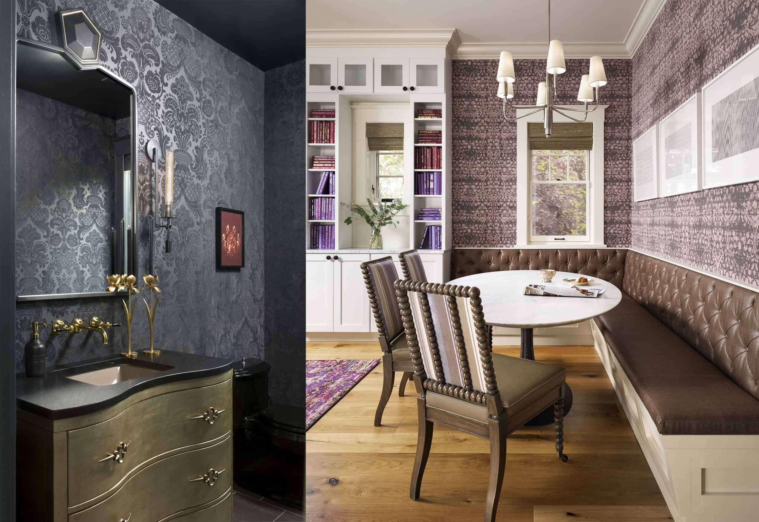
The FAIRFAX Project black powder room and DOWNING Project breakfast nook
And who wouldn’t fall for the bold, beautiful color we incorporated in the FAIRFAX Project kids’ den. We used an intense blue to play off other colors in the home, allowing the art leading up the stairwell to hint at the color. Then once you turned the corner at the top of the stairs, you were treated to a cozy room wrapped in the color of the sea.
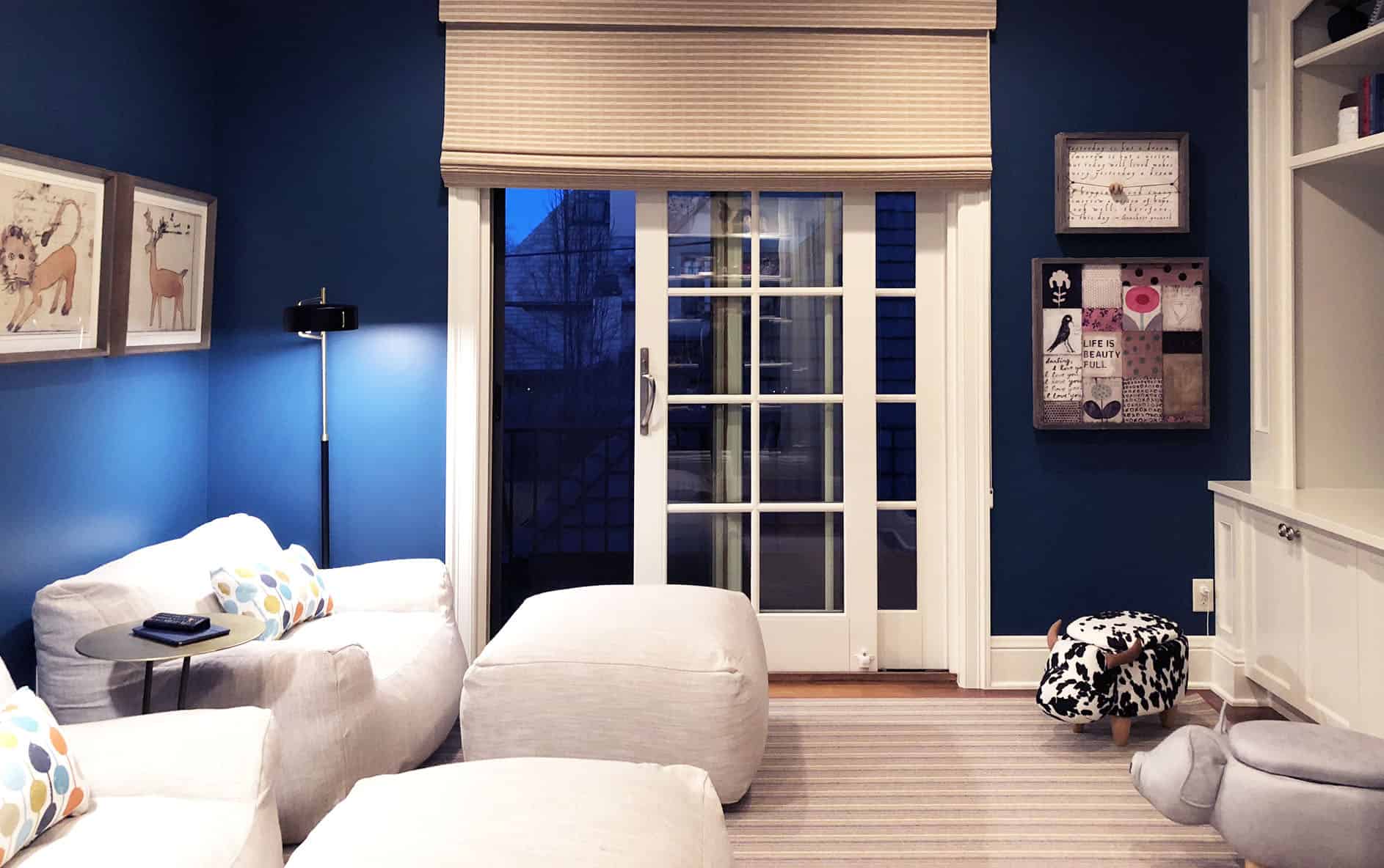
FAIRFAX Project Kids’ Den
Photos contained within blog are not necessarily Duet Design Group projects.
Are you searching for your an interior designer in the Vail and Beaver Creek area? We bring our luxury design services to the Vail Valley! Let’s be in touch.